.svg)
subdirectory_arrow_right


Craig Stevenson
Founder and Director
Why visual design matters in digital learning
In digital learning, visual design plays a critical role in how people experience and use learning, not just how it looks. Good visual design supports clarity, guides attention and helps learners move through content with confidence.
When design is treated as decoration, learning can quickly become harder to follow. Poor spacing, inconsistent layouts and unclear navigation increase cognitive load and make it more difficult for learners to focus on what matters. Thoughtful design reduces friction and supports understanding, allowing people to spend their energy on learning rather than on figuring out how to use the interface. Clear visual systems help learners recognise patterns, follow sequences and retain information more effectively. Over time, familiarity with consistent design reduces friction, making learning easier to return to and easier to complete. Good design quietly supports comprehension, recall and confidence.
As learning increasingly moves onto mobile devices, the role of visual design becomes even more important.
Why mobile-responsive visual design matters
Effective visual design goes beyond aesthetics. It shapes how learners interact with content and whether learning feels intuitive or frustrating.
Design influences whether learners can focus on what matters, whether the interface feels easy to use on all devices and whether the design guides them clearly through the learning journey without friction.
A mobile-responsive approach ensures content performs just as well on a smartphone as it does on a desktop. Learners can move between devices without losing clarity, flow or progress. This flexibility makes learning easier to complete and easier to return to over time.
Learners rarely complete digital learning in a single sitting. Many start on a desktop, return later on a phone and finish on a tablet. When experiences change across devices, confidence drops and completion rates suffer. Learners are forced to relearn navigation, find their place again and adjust to new layouts.
A mobile-responsive approach ensures continuity. Structure, visual rhythm and navigation remain predictable regardless of screen size. This predictability reduces cognitive load, supports momentum and makes learning easier to complete in real work conditions.
Mobile-first eLearning that works anywhere
Designing for mobile is not about shrinking a desktop layout. It requires rethinking how content is structured and how interactions behave on smaller screens.
Touch-friendly navigation, readable text, scalable visuals and accessible colour contrast are essential. Lightweight motion and fast, reliable loading also play an important role in creating a smooth learning experience.
When mobile-first design is done well, learning feels calm, predictable and easy to use across devices. When it is not, learning can feel fragile and frustrating. Small problems quickly become significant barriers. Text becomes difficult to read, buttons are hard to tap, layouts feel cramped and scrolling becomes tiring. Heavy media increases load times, while interactions designed for large screens can feel awkward or unreliable on touch devices.
These issues quietly reduce engagement. Learners abandon modules more easily, return less often and are less likely to complete learning journeys. Over time, this impacts both completion rates and real-world application.
Designing with clarity and confidence
Clear structure and consistent visual systems support confidence. Learners know where they are, what to do next and how to move through the content without hesitation.
This reduces cognitive load and makes learning easier to engage with, especially in time-pressured work environments. Visual consistency also supports recognition and recall, helping learners build familiarity across modules and programmes.
Good design does not distract from learning. It quietly supports it.
Thoughtful visual design in practice
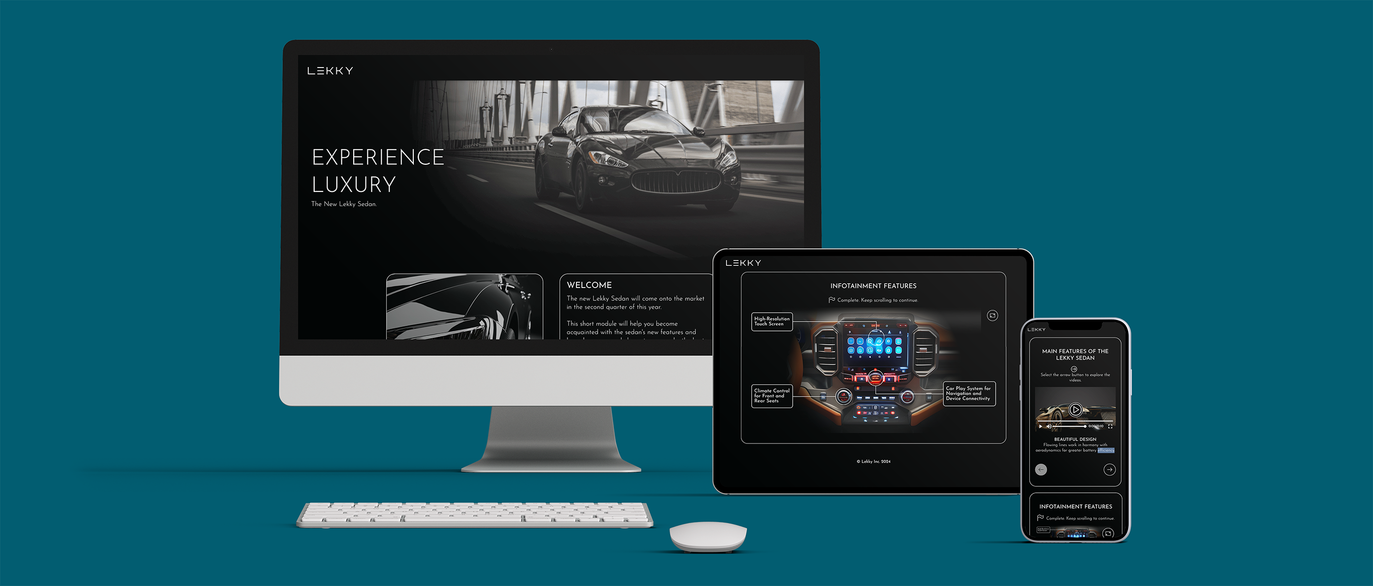
At Arck, we use the Evolve authoring tool to create mobile-ready eLearning that adapts intelligently to real-world use. Visual design is treated as part of the learning system rather than a final layer.
Every course is designed to be:
- Visually consistent and on-brand across devices
- Easy to navigate on mobile, tablet, and desktop
- Interactive, accessible, and built for real environments
This approach supports clarity, confidence and real-world application.
Learn more about visual design in eLearning
If you’re keen to explore this topic further, check out the webinar I delivered for Intellum, Unlock the Power of Visual Design in eLearning.
It’s a practical session focused on real design decisions rather than theory on how to make your digital learning more engaging, consistent, and effective through smart visual design.
It was created in collaboration with Intellum and reflects the same approach we use at Arck Learning on client projects every day.
Want to develop your own skills?
Head over the the Arck Learning YouTube channel for tutorials on designing in Evolve.